Classic styling for Pantone's colour of the year 2020
We’re seeing Pantone’s colour of the year for 2020 everywhere – and that’s because it’s the classic it claims to be. Classic Blue is rich and timeless and yet, used in the right way, can offer unmeasured impact.
This bold, dramatic hue has littered the fashion runways and punctuated interior design around the world. Here, we consider how to style it around the home and explain why you can’t have too much of this serene and calming colour.
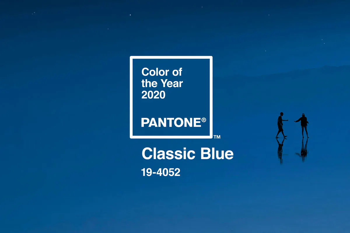
Image Dezeen.
Feelings associated with Classic Blue
Every year, Pantone, the colour-matching system used universally by many industries including print and graphic design, releases its favoured colour for the year ahead. Classic Blue takes the baton from 2019’s Living Coral, as Pantone described it as ‘a reassuring presence instilling calm, confidence and connection’. Traditionally, shades of blue are associated with feelings of calm and tranquility and this sentiment was echoed by Pantone as it explained its choice. The American company said Classic Blue ‘brings a sense of peace and tranquility to the human spirit, offering refuge’. This bold hue makes sense – our homes are sanctuaries of calm in which we can shut out the chaos of the outdoors.
This almost cobalt blue (sitting comfortable between navy and royal) will stand alone to make a strong statement or can be paired with other blue shades to make a neutral room pop.
Stand-out statement style
Blue in our homes isn’t a new concept – this go-to colour has long been embraced by interior enthusiasts. But Pantone’s announcement challenges us to get creative and use it to its full potential. The bedroom is the ideal room to go all-out blue – get inspired by the night sky and invite peace and calm in. Identify an accent wall and paint it blue for depth and drama that strikes a balance with a restful quality. Dot carefully placed tonal accessories around the room to give a nod to the statement wall.
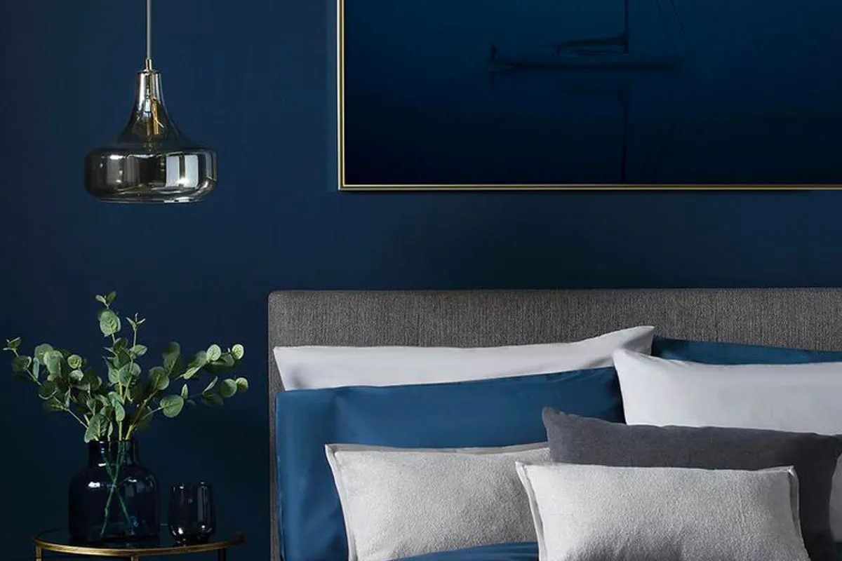
Image: House beautiful.
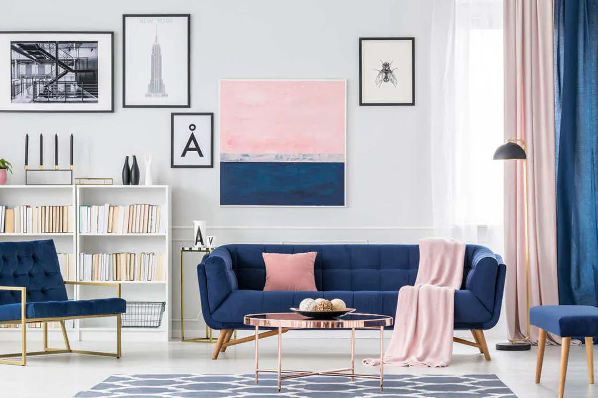
Image: Tennessean.
Accessorising to add a pop of colour
If you don’t want to cover a wall, consider instead getting playful with unique ways to bring the hue to the forefront – without overwhelming. Statement furniture, throws and cushions are perfect for dotting around the room and won’t overtake any of your other treasured pieces. Other ideas include oversized rugs in reception rooms or painted kitchen cabinets and cupboards to add a pop of colour to an often clinical-feeling room. You could also paint internal doors in the blue hue to ensure the side of the door facing your beautifully blue room sits perfectly within it.
Still need inspiration? Get in touch with us to discuss the Pantone colour.